The other day my supervisor gave me an interesting paper to read on data visualization: Designing Alternative Representations of Confusion Matrices to Support Non-Expert Public Understanding of Algorithm Performance (full reference below, on further reading).
In case you don’t know what a confusion matrix is, is a tool that we use in machine learning to visualize the performance of a classification algorithm.
This kind of algorithms have some data, that can be in some class or not, and try to predict whether new data is in that class or not. For example, let’s say we have a model that classifies incoming mail as spam or not, we can use a confusion matrix to visualize how our original data is classified.
The confusion matrix is a contingency table of the training data with two dimensions: actual and predicted, i.e.: a 2x2 table with every possibility of correct prediction, incorrect prediction, actually in that class, and actually not in that class.
To facilitate its visualization, this table is usually coloured as a heatmap, where every square has a colour representing the “strength” of the value.
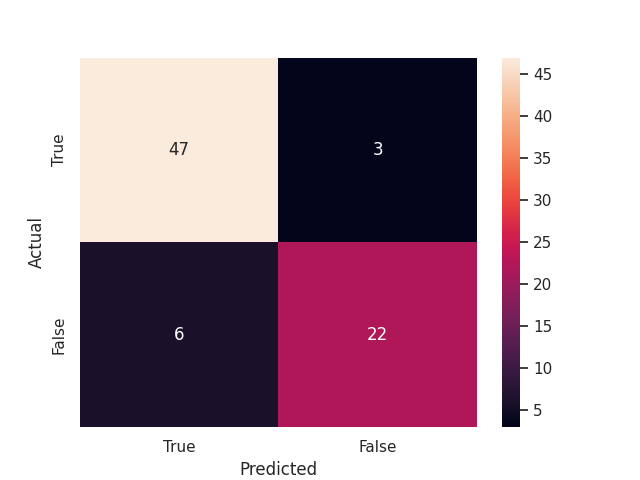
A sample confusion matrix with 47 True Positives and 22 True Negatives (69 correct predictions) and 9 incorrect predictions
Nevertheless, all of this can be difficult to understand at a glance for people who are not into Machine Learning, and that’s why Shen et. al explored those alternatives.
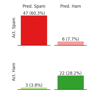
Using bar charts
In the previously mentioned research paper, Hong et al. explore different representations of the same data and how they are understood by non-experts. From the results of their experiment, we can conclude that using a flow chart is the best way to make users who are not familiar with these plots understand them. Nevertheless, bar charts are better for simulating in your head, i.e.: calculating where a certain case will fall in the classes.
Furthermore, bar charts are easier to code and take up less space, so we decided to use them for a technical audience who might not be familiar with confusion matrices but surely is familiar with bar charts.

The same data, but with another way of displaying it
This figure highlights how there is a lot more spam than ham (non-spam).
Finally, without further ado, the Python code used to create this plot is:
_palette = sns.colour_palette('Paired')

_total = _toplot['count'].sum()
_max = _toplot['count'].max()
_toplot['pct'] = _toplot['count'] / _total
print(_toplot)
print("Total:", _total, "max:", _max)

with sns.axes_style("white"):
    # Get the colour map
    # https://stackoverflow.com/a/38575399/4505998
    g = sns.catplot(
        data=_toplot.reset_index(), y='count', col='Predicted', row='Actual',
        kind='bar', height=2, margin_titles=True, palette=_palette,
    )

g.set(
    # Set the ylim to the 120% to leave some space for letters
    ylim=(0,_max*1.2),
    # Remove left ticks (redundant)
    yticks=[],
)

# Setting the titles
for ax,l in zip(g.axes[:,0],g.row_names):
    ax.set_ylabel(l)
g.set_titles(col_template="{col_name}", row_template="")

# Making it more beautiful
g.despine(left=True)

colours = [5, 4, 2, 3]
for i, ax in enumerate(g.axes.ravel()):
    # Setting the bar labels
    # Display the number and percentage of proposals in each class
    for c in ax.containers:
        labels = [f'{v.get_height():.0f} ({v.get_height()/_total*100:.1f}%)' for v in c]
        ax.bar_label(c, labels=labels)

        # Set the colour of each bar to a colourmap
        for b in c:
            # plt.setp(b, colour=_cmap(b.get_height() / _max))
            # plt.setp(b, colour=_cmap(b.get_height() / _total))
            plt.setp(b, colour=_palette[colours[i]])

plt.savefig("bars.png")
References and Further reading
- Complete code with imports on Kaggle
- Hong Shen, Haojian Jin, Ángel Alexander Cabrera, Adam Perer, Haiyi Zhu, and Jason I. Hong. 2020. Designing Alternative Representations of Confusion Matrices to Support Non-Expert Public Understanding of Algorithm Performance. Proc. ACM Hum.-Comput. Interact. 4, CSCW2, Article 153 (October 2020), 22 pages. https://doi.org/10.1145/3415224
- Confusion Matrix - Wikipedia
Finally, if you liked this post, you might like other posts about data visualization like Creating a HeatMap with marginal distributions using Seaborn