In this short post I will just share the code on how I created a very neat Heatmap for my Master’s Thesis using Seaborn. It took me a while but I’m very proud of how it turned out.
For this, I used the JointGrid tool, which allows me to make a multi-plot grid for conditional relationships, where we can show the marginal distributions on the top and right parts of the graph.
The jointplot function has already many things built in, for plotting something like a scatter plot (with x and y variables) while showing its distribution.
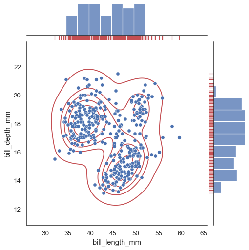
Sample figure from Seaborn’s official documentation
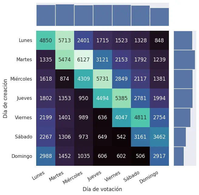
In my case, what I wanted to plot wasn’t a scatter plot, It did not have an x nor an y, it was a ol’ heatmap created from a pd.crosstab.
This is my data:
array([[4850, 5713, 2401, 1715, 1523, 1328,  848],
       [1335, 5474, 6127, 3121, 2153, 1792, 1239],
       [1618,  874, 4309, 5731, 2849, 2117, 1381],
       [1802, 1353,  950, 4494, 5385, 2781, 1994],
       [2199, 1401,  989,  636, 4047, 4811, 2754],
       [2267, 1306,  973,  649,  542, 3161, 3462],
       [2988, 1452, 1035,  606,  602,  506, 2917]])
At first, I was going to create a Heatmap and two barplots, but then I decided to try to combine them all into one, and here is the result:

A heatmap on when a proposal is created and when is voted in a certain voting system (to be published)
The code to accomplish this was the following:
# _toplot = pd.crosstab(...)

# Create an empty joint grid
grid = sns.JointGrid()

# Fill the centre with our heatmap
sns.heatmap(_toplot, ax=grid.ax_joint, cbar=False, annot=True, fmt='g', cmap='mako')
# Draw total bars, both with width 1, but the Y one with horizontal orientation
sns.barplot(_toplot.sum(), ax=grid.ax_marg_x, width=1)
sns.barplot(_toplot.sum(axis=1), ax=grid.ax_marg_y, orient='h', width=1)
# Offset value (just half an unit)
_off = .5

# Fix x
_xmin, _xmax = grid.ax_joint.get_xlim()
grid.ax_joint.set_xlim(_xmin+_off, _xmax+_off)
for bar in grid.ax_marg_x.containers[0]:
    bar.set_x(bar.get_x() + _off)

# Fix y
_ymin, _ymax = grid.ax_joint.get_ylim()
grid.ax_joint.set_ylim(_ymin+_off, _ymax+_off)
for bar in grid.ax_marg_y.containers[0]:
    bar.set_y(bar.get_y() + _off)

# Need to use this to set the horizontal_alignment
grid.ax_joint.set_xticklabels(
    grid.ax_joint.get_xticklabels(),
    rotation=30,
    ha='right'
)
grid.ax_joint.yaxis.set_tick_params(rotation=0)

grid.ax_joint.set_xlabel('Día de votación')
grid.ax_joint.set_ylabel('Día de creación')
Further reading
After coming up with this solution, I found this StackOverflow post:
But the answer relies too much on modifying the data, and won’t work if the indexes are not a range of integers.
There’s also a discussion on GitHub about this which I replied to.